Published: Friday, Mar 13, 2015 Last modified: Tuesday, Jul 7, 2026
Rule 1
Have a URL that addresses the issue as clearly as possible.
Every time I see help documents that has something like: Menu → Settings → Advanced Settings → Network → Add, I cringe.
The URL should be something like https://example.com/settings/network/add. Plain and simple. Firefox is terrible at this and Chrome’s are much better with items like chrome://settings/certificates, but many of them are inconsistent and not used from their own awful accordion style documentation, which goes on to break Rule 2.
Other times, I have a particular question and I can only find an answer perhaps on an outdated forum. The service I am dealing with, should have the canonical answer on a [[FAQ that does not suck|How to create a FAQ that does not suck]]. E.g. Does Webconverger support touch screens? Here have a look at: http://webconverger.com/faq/#does-webconverger-support-touch-screens.
Rule 2
Make the site Ctrl+F-able
One of my learnings about how people use http://greptweet.com/ is that people prefer Ctrl+F instead of actually using the search box.
Chrome’s Ctrl+F is fast, gives great highlight indicators to matched word, number of matches and where they are in the document by markers on the scrollbar.
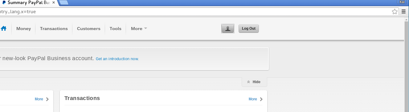
The very worse example I’ve found is Paypal’s new 2014 UI refresh. Settings are hidden behind an icon of a head. Seriously.